.jpg)
Tuesday, August 12, 2025
-
10
min
How to Build a Marketplace App With Expo, Swell and MarketLaunch

In this post our senior engineer, Scott, will walk you through how to build your first marketplace application using Swell, Expo and MarketLaunch.
What is MarketLaunch?
MarketLaunch is an open-source development kit which enables businesses to launch their own e-commerce marketplaces in days rather than months. It provides the scaffolding around the ‘back-office’ parts of a platform, such as sign-up, order management, product management, etc. To achieve this, it uses the Swell's headless e-commerce platform. It enables you to support multiple vendors on your store, enabling you to rapidly build out a marketplace experience.
In this post, we’ll cover how to build a cross-platform app running against the MarketLaunch and Swell platforms.
How do we get started?
To get started with MarketLaunch, the first thing you’ll need to do is create a Swell account.
Then, you’ll also need to create a Stripe account.
Next, we’ll need to clone the MarketLaunch project from GitHub:
git clone git@github.com:morrowdigital/MarketLaunch.git
Once cloned, we’ll copy the .env.local.example over to .env.local, and fill out the values:
SWELL_SECRET_KEY- this can be created from the Swell admin panel (Developer → API keys → Add secret key)NEXT_PUBLIC_SWELL_STORE_ID- As above, this can be obtained from the Swell admin panel (Developer → API keys)NEXT_PUBLIC_SWELL_PUBLIC_KEY- Once more, this can be obtained from the Swell admin panel (Developer → API keys)STRIPE_API_KEY- This can be obtained through your Stripe account admin dashboard (Developers → API keys) - for the purpose of this article, we’ll use our test secret keySTRIPE_API_VERSION- This can be obtained through the Stripe documentation (https://docs.stripe.com/api/versioning )
With our enviroment variables all set it's time to run through the setup instructions - as of writing, these are:
- Run
corepack enableto makeyarnavailable - Run
yarn installto fetch and install all dependencies. - Run
yarn marketlaunch:setupand follow the instructions to setup Swell. - Run
yarn devto start the nextJS development mode.
As always, check the project repository for the most up-to-date instructions. As noted in step 3, there may be additional steps to complete.
Assuming everything went as expected, you should now have a basic MarketLaunch project up and running on your local machine.
The project should be running at http://localhost:3000 - this is the back-office panel:
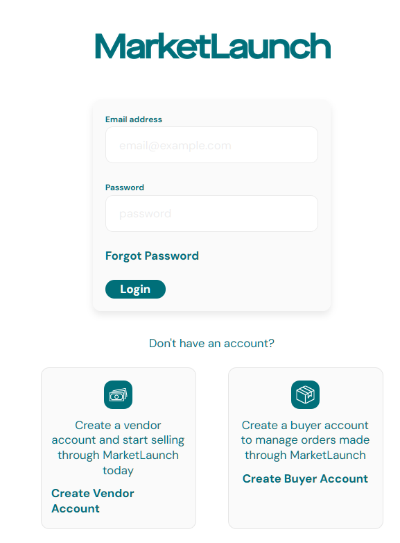
Let’s register a vendor account:
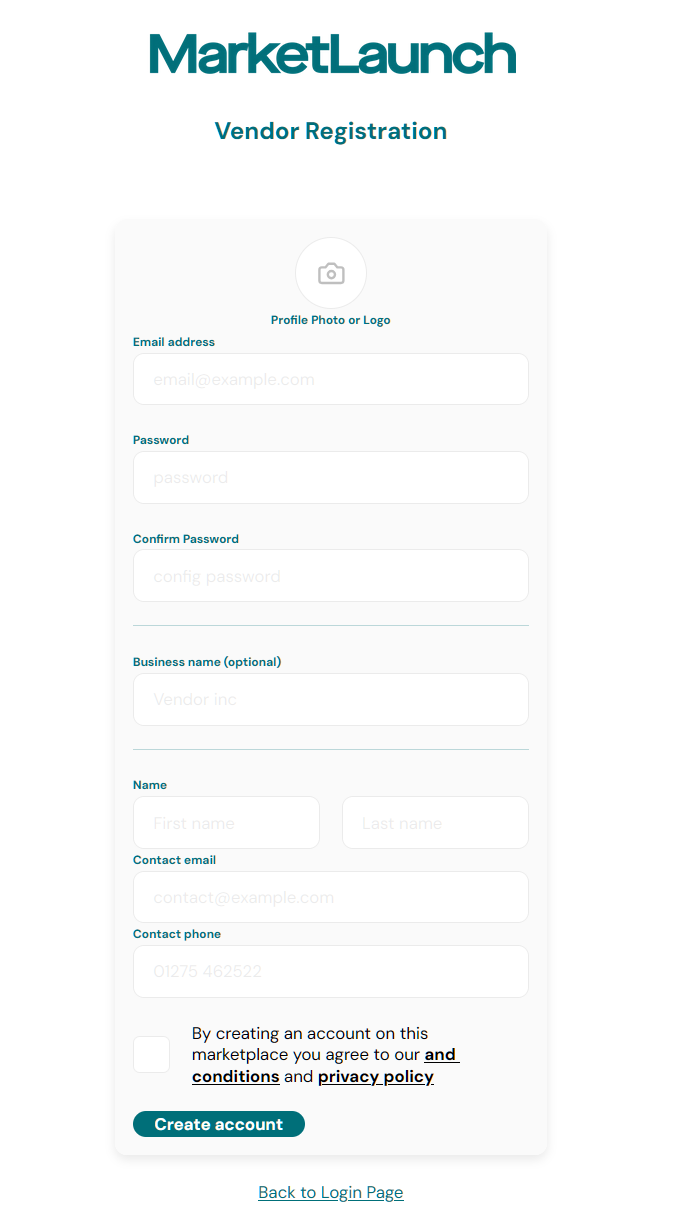
Once you’ve created a vendor account, login and navigate to the ‘Products’ page via the link in the left-side. From here, we’ll click ‘New Product’ in the top-right corner, and fill out some details:
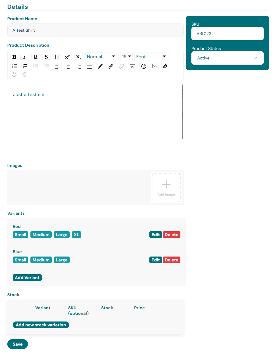
This product, once created, will ‘belong’ to your vendor account, and cannot be seen or managed by other vendor accounts.
Building out the app - the foundations
We’ve now setup a product in our catalogue, meaning we can now look to build out a customer-facing experience. We won’t be building out an entire e-commerce project, but will be covering things like product, cart, orders, etc.
For the purpose , we’re going to use the default Expo template, so let’s start by initialising an Expo project:
npx create-expo-app@latest
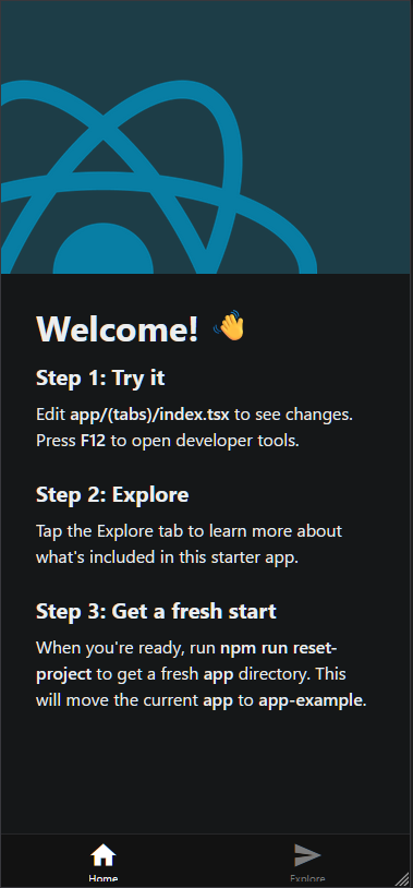
Once we follow the prompts and the command finishes running, we’ll open the project in our code editor. Let’s continue by running yarn start from the project directory. I’m going to assume you have Expo Go installed on a device, but you can use a simulator if you prefer.
We can then either scan the QR code in the terminal to open the Expo Go app, open http://localhost:8081 in our browser, or both. Assuming everything went as expected, we should see the standard Expo welcome app:
To continue with building out our e-commerce experience, we’ll need to install the Swell-JS library.
First, let’s create a .env file in our project root, and add the following:
EXPO_PUBLIC_SWELL_STORE_ID=<your swell store id>
EXPO_PUBLIC_SWELL_PUBLIC_KEY=<your swell public key>
Both of these values are the same as the ones you setup in the MarketLaunch env file.
Next, stop the Expo bundler, and then run:
npm i swell-js
Now we’ve got swell-js installed, let’s initialize the client. We’ll do this at the root _layout.tsx file:
import swell from 'swell-js';

// Initialize client with your store ID and a public key
swell.init(	process.env.EXPO_PUBLIC_SWELL_STORE_ID,	process.env.EXPO_PUBLIC_SWELL_PUBLIC_KEY)
Now, restart the bundler with npm run start or yarn start.
Before we start doing anything else, let’s verify that we can actually talk with our Swell store backend. Add the following code into the RootLayout component - right after the useFonts hook:
const run = async () => {
	const products = await swell.products.list()
    console.log(products)
}

useEffect(() => {
	run()
 }, [])
Then, open the browser console, navigate to http://localhost:8081, and check the ‘console’ tab. You should see an object logged which lists a results property (an array of objects - where each object is 1 product).
Assuming that all works as expected, you can remove the run function and the useEffect.
Now, let’s create a few pages for our app. For simplicity, we’ll keep the tabs layout. Let’s add the following files:
app/(tabs)/product/index.tsxapp/(tabs)/product/[id].tsx
The first item in that list is going to be our product listing, and the second one is going to be our product information page.
Now, let’s make our products tab visible, and give it an appropriate icon, while hiding our ‘product info’ page from the tab bar. In app/(tabs)/_layout.tsx, add a new tab screen entry:
<Tabs.Screen
  name="product/index"
  options={{
    title: 'Products',
    tabBarIcon: ({ color }) => <IconSymbol size={28} name="bag.fill" color={color} />,
  }}
/>

<Tabs.Screen
  name="product/[id]"
  options={{
    href: null,
  }}
/>
Now, let’s copy the contents of the app/(tabs)/explore.tsx into app/(tabs)/product/index.tsx and app/(tabs)/product/[id].tsx so we actually render something when we tap on that tab:
At this point, we now have everything we need to start building out our experience.
Building out an app - Product UI
To begin with our shopping UI, we need to display products. Let’s start by listing what information we want to show in our product listing.
- Product picture (or placeholder)
- Product name
- Price
We’ll call this our ‘product card’. Create a file at components/ProductCard.tsx with the following content:
import { Link } from 'expo-router';
import { Image, StyleSheet, Text, View } from 'react-native';

interface IProps {
  productId: string;
  imageUrl?: string;
  productName: string;
  productPrice: string;
}

export const ProductCard: React.FC<IProps> = ({ productId, imageUrl, productName, productPrice }) => {
  return (
    <Link href={{ pathname: '/product/[id]', params: { id: productId } }}>
      <View style={styles.container}>
        <View style={styles.imageContainer}>
          {imageUrl && (
            <Image
              source={{ uri: imageUrl }}
              resizeMode="cover"
              style={styles.image}
            />
          )}
          {
            !imageUrl && (
              <View style={styles.image}>
                <Text style={styles.productName}>No image</Text>
              </View>
            )
          }
        </View>
        <View style={styles.content}>
          <Text style={styles.productName} numberOfLines={1}>{productName}</Text>
          <Text style={styles.productPrice}>{productPrice}</Text>
        </View>
      </View>
    </Link>
  );
};

const styles = StyleSheet.create({
  container: {
    marginHorizontal: 15,
    marginBottom: 20,
    // width: '50%',
    flexBasis: "30%",
    flex: 1,
    height: 300,
    shadowColor: '#000',
    shadowOffset: { width: 0, height: 2 },
    shadowOpacity: 0.2,
    borderRadius: 8,
    overflow: 'hidden'
  },
  imageContainer: {
    width: '100%',
    height: 200,
    borderRadius: 8,
    overflow: 'hidden',
    backgroundColor: '#f5f5f5'
  },
  image: {
    width: '100%',
    height: '100%',
    borderTopLeftRadius: 8,
    borderTopRightRadius: 8,
    justifyContent: "center",
    alignItems: "center"
  },
  content: {
    padding: 15,
    flex: 1
  },
  productName: {
    fontSize: 24,
    fontWeight: '700',
    color: '#bbb',
    marginBottom: 4,
    overflow: 'hidden',
  },
  productPrice: {
    fontSize: 18,
    fontWeight: '700',
    color: '#e91e63'
  }
})
Note: We’re only passing in specific properties, but you could instead pass in the entire swell.Product entry and parse the properties out within the component.
Let’s adjust our app/(tabs)/product/index.tsx file to instead retrieve and display our products:
import { ActivityIndicator, StyleSheet } from 'react-native';

import ParallaxScrollView from '@/components/ParallaxScrollView';
import { ProductCard } from '@/components/ProductCard';
import { ThemedText } from '@/components/ThemedText';
import { ThemedView } from '@/components/ThemedView';
import { IconSymbol } from '@/components/ui/IconSymbol';
import { useEffect, useState } from 'react';

import swell from 'swell-js';

export default function ProductsScreen() {

  const [loadingProducts, setLoadingProducts] = useState<boolean>(false);
  const [products, setProducts] = useState<swell.Product[]>([])

  const getProducts = async () => {
    setLoadingProducts(true)
    try {
      const _products = await swell.products.list()
      setProducts(_products.results)
    } finally {
      setLoadingProducts(false)
    }
  }

  useEffect(() => {
    getProducts()
  }, [])

  if (loadingProducts) {
    return (
      <ActivityIndicator />
    )
  }

  return (
    <ParallaxScrollView
      headerBackgroundColor={{ light: '#D0D0D0', dark: '#353636' }}
      headerImage={
        <IconSymbol
          size={310}
          color="#808080"
          name="chevron.left.forwardslash.chevron.right"
          style={styles.headerImage}
        />
      }>
      <ThemedView style={styles.titleContainer}>
        <ThemedText type="title">Products</ThemedText>
      </ThemedView>

      <ThemedView style={styles.productList}>
        {
          products.map((product) => {
            return (
              <ProductCard
                productId={product.id!}
                imageUrl={product.images?.[0]?.file?.url}
                productName={product.name}
                productPrice={[product.currency, (product.price ?? 0)?.toFixed(2)].join(" ")}
                key={product.id}
              />
            )
          })
        }
      </ThemedView>

    </ParallaxScrollView>
  );
}

const styles = StyleSheet.create({
  productList: {
    flexDirection: 'row',
    flexWrap: 'wrap'
  },
  headerImage: {
    color: '#808080',
    bottom: -90,
    left: -35,
    position: 'absolute',
  },
  titleContainer: {
    flexDirection: 'row',
    gap: 8,
  },
});
Note: The goal with this is to keep everything self-contained for the purposes of the article, but you may wish to use a cleaner approach, such as using tanstack-query or similar, in order to reduce refetches.
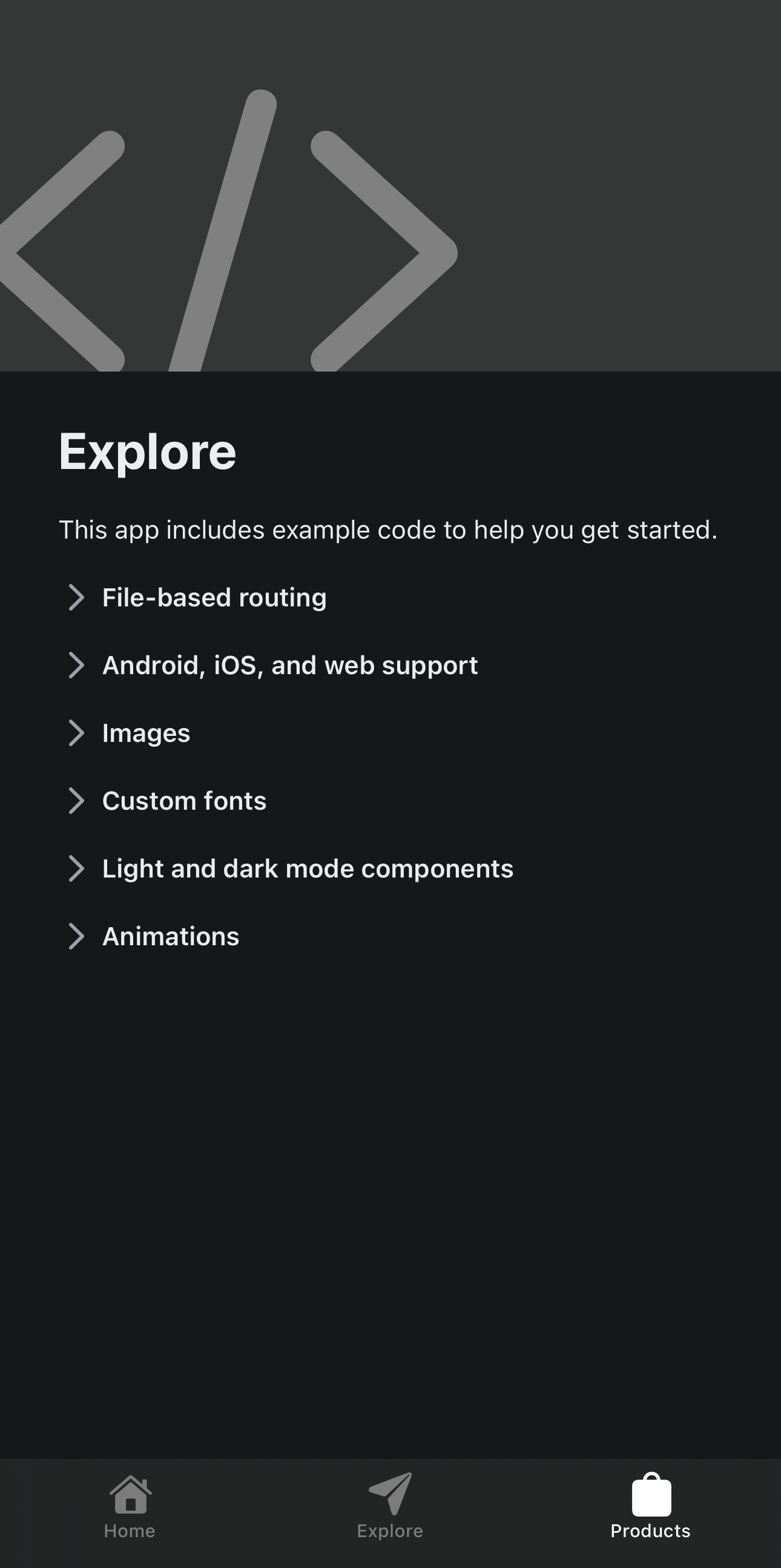
Now, if we go back to our products tab, we should see something like this:
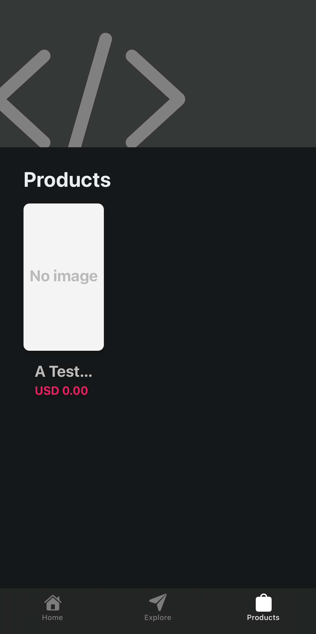
Fantastic! Before we continue, let’s recap what we’ve done:
- Setup our MarketLaunch local instance
- Created a vendor account
- Added a product
- Initialised an Expo app to act as a marketplace front-end
- Created a product card to display basic information
- Setup our products list page
Let’s move on to our product information page. For this, we’ll be displaying more in-depth information, such as product name, product description, images, and other information the user might find useful, as well as being able to.
In our app/(tabs)/product/[id].tsx, we’ll create a basic layout:
import { ActivityIndicator, Image, KeyboardAvoidingView, StyleSheet, TextInput, TouchableOpacity } from 'react-native';

import ParallaxScrollView from '@/components/ParallaxScrollView';
import { ThemedText } from '@/components/ThemedText';
import { ThemedView } from '@/components/ThemedView';
import { useCallback, useEffect, useState } from 'react';

import { useLocalSearchParams } from 'expo-router';
import { useSafeAreaInsets } from 'react-native-safe-area-context';
import swell from 'swell-js';

export default function ProductInfoScreen() {
  const params = useLocalSearchParams<{ id: string }>()
  const insets = useSafeAreaInsets()

  const [loadingProduct, setLoadingProduct] = useState<boolean>(false);
  const [quantity, setQuantity] = useState<number>(1)
  const [product, setProduct] = useState<swell.Product>()

  const getProduct = async () => {
    setLoadingProduct(true)
    try {
      const _product = await swell.products.get(params.id)
      setProduct(_product)
    } finally {
      setLoadingProduct(false)
    }
  }

  useEffect(() => {
    getProduct()
  }, [])

  const handleQuantityChange = useCallback((qty: string) => {
    const valueAsNumber = Number(qty)
    if (!isNaN(valueAsNumber)) {
      setQuantity(valueAsNumber)
    }
  }, [])

  if (loadingProduct) {
    return (
      <ActivityIndicator />
    )
  }

  return (
    <KeyboardAvoidingView
      style={{
        flex: 1,
        marginBottom: insets.bottom + 60,
        justifyContent: 'center',
      }}
      behavior='height'
    >
      <ParallaxScrollView
        headerBackgroundColor={{ light: '#D0D0D0', dark: '#353636' }}
        headerImage={
          <Image
            source={{ uri: product?.images?.[0]?.file?.url }}
            resizeMode="cover"
            style={styles.headerImage}
          />
        }>
        <ThemedView style={styles.titleContainer}>
          <ThemedText type="title">{product?.name}</ThemedText>
        </ThemedView>
        <ThemedText type="default">{product?.description}</ThemedText>
        <ThemedText type="subtitle">{product?.currency} {product?.price}</ThemedText>
      </ParallaxScrollView>
      <ThemedView style={[styles.row, styles.fixedBottom]}>
        <TextInput
          style={styles.textInput}
          keyboardType='number-pad'
          placeholder='Quantity'
          value={quantity?.toString()}
          onChangeText={handleQuantityChange}
        />
        <TouchableOpacity style={styles.button}>
          <ThemedText type="defaultSemiBold">Add to cart</ThemedText>
        </TouchableOpacity>
      </ThemedView>
    </KeyboardAvoidingView>
  );
}

const styles = StyleSheet.create({
  row: {
    flexDirection: 'row',
    gap: 10
  },
  fixedBottom: {
    alignSelf: 'flex-end',
    justifyContent: 'flex-end',
  },
  textInput: {
    borderRadius: 5,
    backgroundColor: 'rgba(255,255,255,0.2)',
    flexGrow: 1,
    flexBasis: "30%",
    color: 'white',
    fontSize: 24,
    padding: 10,
  },
  button: {
    paddingHorizontal: 15,
    paddingVertical: 15,
    backgroundColor: 'rgba(162, 0, 255, 1)',
    borderRadius: 5,
    flex: 1,
    flexShrink: 1,
    justifyContent: 'center',
    alignItems: 'center'
  },
  headerImage: {
    color: '#808080',
    bottom: -90,
    left: -35,
    position: 'absolute',
  },
  titleContainer: {
    flexDirection: 'row',
    gap: 8,
  },
});
Note: We’ve manually defined a custom bottom margin, as without this, the content will flow behind the tab bar. This could be solved by using a modal presentation within the _layout.tsx (requires you’re using a stack rather than tab layout - outside the scope of this article).
You’ll also notice that the description is displaying HTML tags. This could be resolved by rendering using a HTML wrapper (webview, or react-native-render-html), but that’s outside the scope of this article.
Now that we’ve got a product information page, let’s move on to creating a cart screen.
Building an app - the cart
Before we can continue, lets create a cart item component at components/CartItem.tsx:
import { Link } from 'expo-router';
import { Image, StyleSheet, Text, View } from 'react-native';

interface IProps {
  product: swell.Product;
  quantity?: number;
}

export const CartItem: React.FC<IProps> = ({ product }) => {
  return (
    <Link href={{ pathname: '/product/[id]', params: { id: product.id! } }}>
      <View style={styles.container}>
        <View style={styles.imageContainer}>
          {product?.images?.[0]?.file?.url && (
            <Image
              source={{ uri: product?.images?.[0]?.file?.url }}
              resizeMode="cover"
              style={styles.image}
            />
          )}
          {
            !product?.images?.[0]?.file?.url && (
              <View style={styles.image}>
                <Text style={styles.productName}>No image</Text>
              </View>
            )
          }
        </View>
        <View style={styles.content}>
          <Text style={styles.productName} numberOfLines={1}>{product.name}</Text>
          <Text style={styles.productPrice}>{[product.currency, product.price].join(" ")}</Text>
        </View>
      </View>
    </Link>
  );
};

const styles = StyleSheet.create({
  container: {
    padding: 10,
    // width: '50%',
    width: '100%',
    shadowColor: '#000',
    shadowOffset: { width: 0, height: 2 },
    shadowOpacity: 0.2,
    borderRadius: 8,
    overflow: 'hidden',
    flexDirection: 'row',
    backgroundColor: 'rgba(255,255,255,0.1)'
  },
  imageContainer: {
    width: "auto",
    height: "100%",
    borderRadius: 8,
    overflow: 'hidden',
    backgroundColor: '#f5f5f5'
  },
  image: {
    width: '100%',
    height: '100%',
    borderTopLeftRadius: 8,
    borderTopRightRadius: 8,
    justifyContent: "center",
    alignItems: "center"
  },
  content: {
    padding: 15,
    flexDirection: 'column'
  },
  productName: {
    fontSize: 24,
    fontWeight: '700',
    color: '#bbb',
    marginBottom: 4,
    overflow: 'hidden',
  },
  productPrice: {
    fontSize: 18,
    fontWeight: '700',
    color: '#e91e63'
  }
})This will only display essential product information but in a more compact format suitable for display in a cart. You’ll notice that instead of passing individual props through, we’re passing through the entire product (for simplicity).
Now let’s create a new file at app/(tabs)/cart.tsx:
import { ActivityIndicator, FlatList, KeyboardAvoidingView, StyleSheet } from 'react-native';

import { ThemedText } from '@/components/ThemedText';
import { ThemedView } from '@/components/ThemedView';
import { useEffect, useState } from 'react';

import { CartItem } from '@/components/CartItem';
import { usePathname } from 'expo-router';
import { useSafeAreaInsets } from 'react-native-safe-area-context';
import swell from 'swell-js';

export default function CartScreen() {
  const insets = useSafeAreaInsets()

  const [loadingCart, setLoadingCart] = useState<boolean>(false);
  const [cart, setCart] = useState<swell.Cart | null>(null)

  const pathName = usePathname()

  const getCart = async () => {
    setLoadingCart(true)
    try {
      const cart = await swell.cart.get()
      setCart(cart)
    } finally {
      setLoadingCart(false)
    }
  }

  useEffect(() => {
    getCart()
  }, [pathName])

  if (loadingCart) {
    return (
      <ActivityIndicator />
    )
  }

  return (
    <KeyboardAvoidingView
      style={{
        flex: 1,
        marginTop: insets.top,
        marginBottom: insets.bottom + 60,
        justifyContent: 'center',
      }}
      behavior='height'
    >
      <ThemedView style={styles.titleContainer}>
        <ThemedText type="title">Cart</ThemedText>
      </ThemedView>
      <FlatList
        data={(cart ?? {})?.items ?? []}
        renderItem={({ item }) => (
          <CartItem
            product={item.product!}
            quantity={item.quantity}
            key={item.product?.id}
          />
        )}
      />
    </KeyboardAvoidingView>
  );
}

const styles = StyleSheet.create({
  row: {
    flexDirection: 'row',
    gap: 10
  },
  fixedBottom: {
    alignSelf: 'flex-end',
    justifyContent: 'flex-end',
  },
  textInput: {
    borderRadius: 5,
    backgroundColor: 'rgba(255,255,255,0.2)',
    flexGrow: 1,
    flexBasis: "30%",
    color: 'white',
    fontSize: 24,
    padding: 10,
  },
  button: {
    paddingHorizontal: 15,
    paddingVertical: 15,
    backgroundColor: 'rgba(162, 0, 255, 1)',
    borderRadius: 5,
    flex: 1,
    flexShrink: 1,
    justifyContent: 'center',
    alignItems: 'center'
  },
  headerImage: {
    color: '#808080',
    bottom: -90,
    left: -35,
    position: 'absolute',
  },
  titleContainer: {
    flexDirection: 'row',
    gap: 8,
  },
});
At the moment, this cart will currently only display the items we have in there, and won’t offer checkout or similar functionality.
Let’s go back to our app/(tabs)/product/[id].tsx and hook up our add-cart functionality:
// Add a new function to add the item to our cart
const handleAddToCart = useCallback(async () => {
try {
const result = await swell.cart.addItem({
product_id: params.id,
quantity,
})
console.log({ result })
} catch (err) {
console.log(err)
}
}, [])
// ...
// Update our 'add to cart' button with the onPress handler
<TouchableOpacity style={styles.button} onPress={handleAddToCart}>
<ThemedText type="defaultSemiBold">Add to cart</ThemedText>
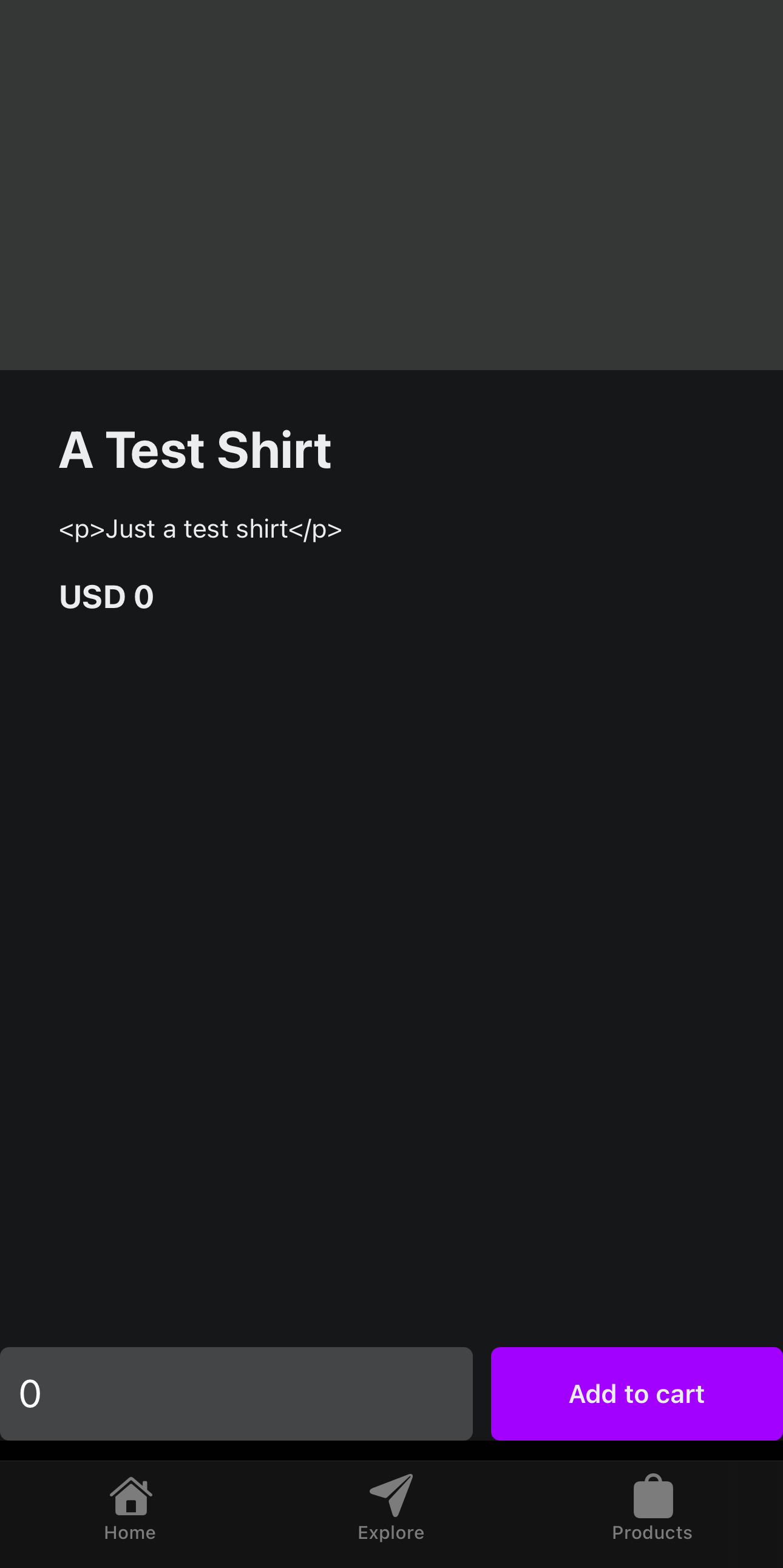
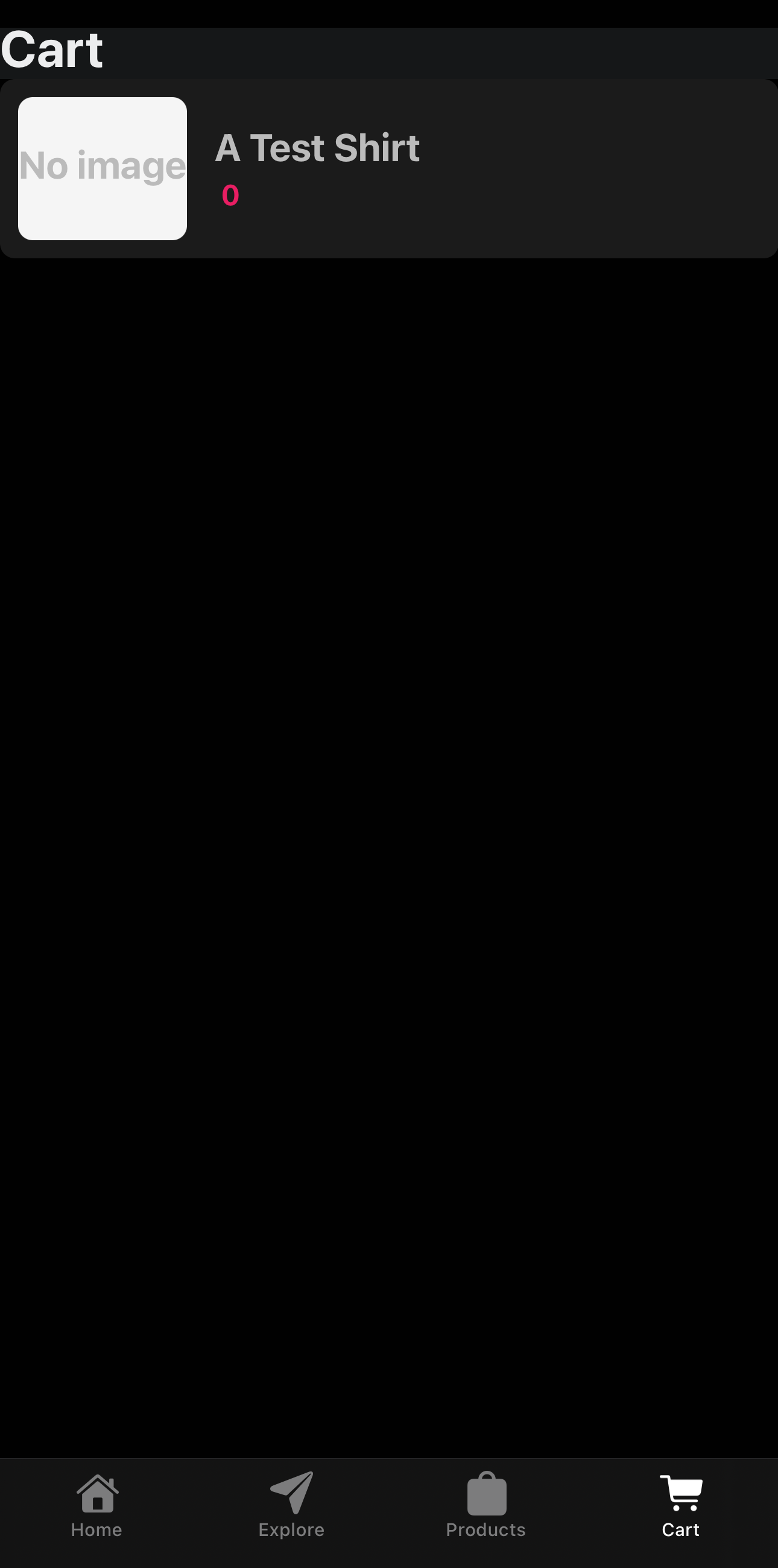
</TouchableOpacity>Now, let’s see if it works as expected. We tap the ‘add to cart’ button, then go to the cart tab, and…
Nothing? No items? That’s definitely not right. This is where we have to start utilising some workarounds. You see, Swell makes use of cookies in order to store its session, which means that it’s not natively compatible with React Native.
Fortunately, we have a workaround. There may be other solutions out there, but the solution we’ve presented here is the one we’ve gone for. To resolve this, we need to add a new file - create the file misc/SwellDocument.ts:
class SwellCookie {
  public stringValue: string = '';

  public match = (re: RegExp): RegExpMatchArray | null => {
    return this.stringValue.match(re);
  }

  public toString = (): string => {
    return this.stringValue;
  }
};

export default class SwellDocument {
  private _cookie: SwellCookie = new SwellCookie();

  get cookie(): SwellCookie | string {
    return this._cookie;
  }

  set cookie(value: SwellCookie | string) {
      this._cookie.stringValue = value as string;
  }
};Now, we need to make this available to our global scope. At the very top of our app/_layout.tsx file, add the following:
import buffer from 'buffer';
global.Buffer = buffer.Buffer;

import SwellDocument from '@/misc/SwellDocument';
//@ts-ignore
global.document = new SwellDocument();This is the only change we need to make. Reload your expo app, and then try to add to the cart again. This time, when you visit the cart, you should see the item in your cart:
Fantastic! We’ve now got our core workflow of products and cart working as intended, albeit in a bit of a barebones state.
Next, we need to look at how we handle checkout. Normally, for React Native, you’d need to build your own checkout and integrate something like Stripe. Fortunately for us, Swell has already done this heavy lifting for us by providing a checkout page. To make use of this, we need to add some more functionality to our app/(tabs)/cart.tsx file:
const handleCheckout = async () => {
  const cart = await swell.cart.get()
  if (!!cart?.checkout_url) {
    const url = cart.checkout_url;
    await Linking.openURL(url)
  }
}
This code can be placed within the body of your functional component (i.e. above the useEffect ) or outside of it, since none of the code we use is reliant on context or similar.
Now, the final step is to add a checkout button below our Flatlist:
<TouchableOpacity style={styles.button} onPress={handleCheckout}>
  <ThemedText type="defaultSemiBold">Checkout</ThemedText>
</TouchableOpacity>
Now, when we tap on the button, assuming we have a valid checkout URL, tapping the button will open the users browser with our checkout. From there, Swell will handle the rest of the process.
Closing thoughts
In this article, we covered setting up MarketLaunch to enable us to rapidly build out a marketplace for multiple vendors, and setting up and building an Expo marketplace app that we’ve been able to easily test within Expo Go due to not requiring any native code.


