
Tuesday, September 5, 2023
-
6
min
Dev tutorial - Native and Web app development with Tamagui

If you are looking for a fast and easy way to create cross-platform UI components and apps with React Native and Web, you might want to check out Tamagui library.
In this blog post, we will introduce you to the features and benefits of using Tamagui library for your UI development.

What is Tamagui?
Tamagui is a React Native + Web UI kit that offers a light design system and style library with themes, animations, responsive and pseudo styles, and much more. It also has a static compiler that flattens your component tree, outputs minimal CSS, and enables SSR-first atomic CSS1.
How to install Tamagui
The easiest way to install Tamagui is by using the starter template:
or
Choose the template: Next + Expo + Solito (recommended for production) - Production-ready universal app with a monorepo.
After installation is complete, you can immediately launch the app in development mode:
- Run for web: yarn web
- Run for native: yarn native
Basic Tamagui components
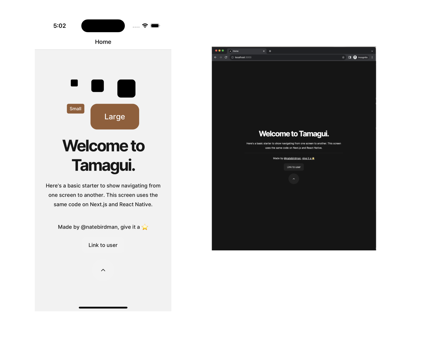
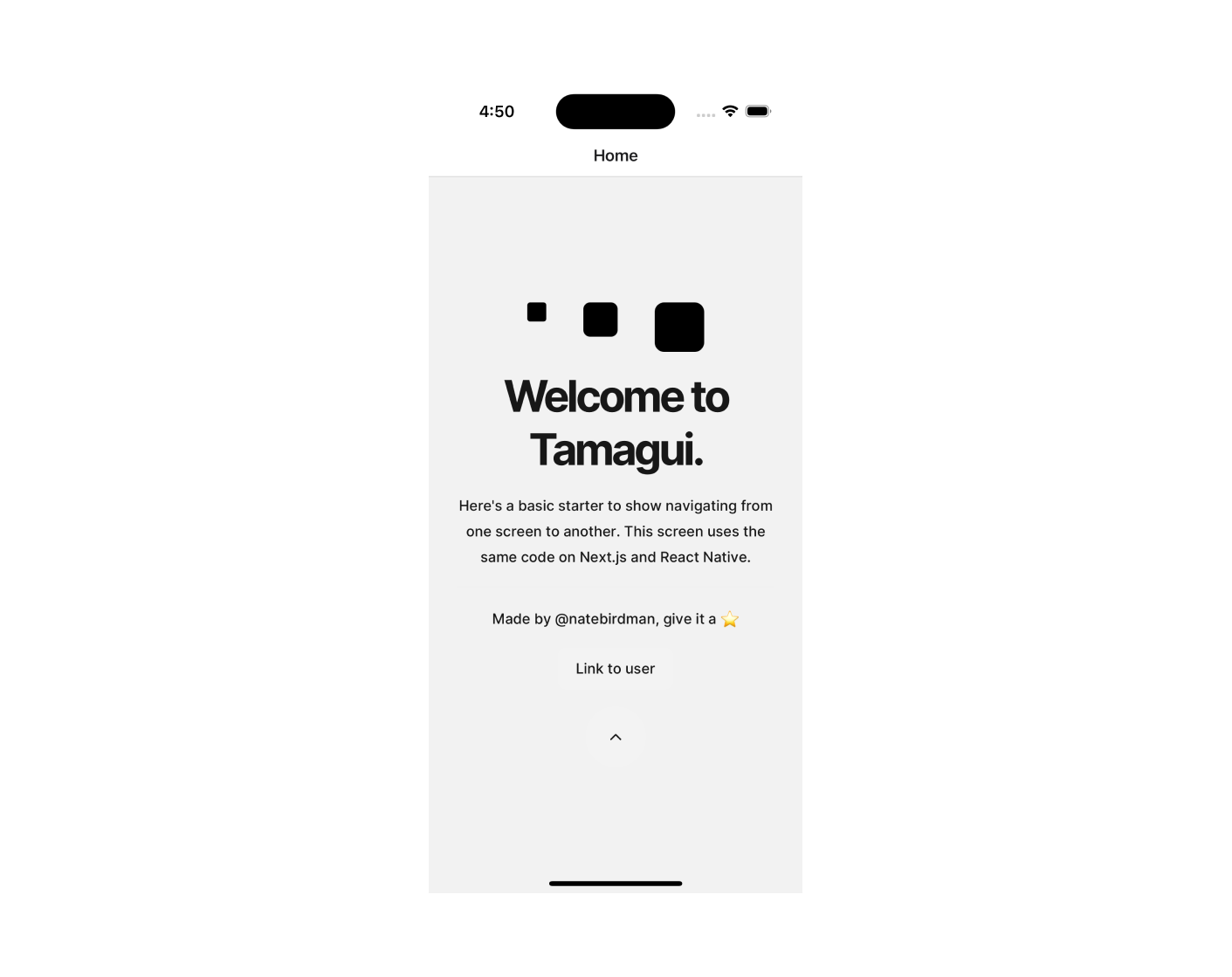
Explore some basic Tamagui components that serve as the building blocks of UIs.
Open the HomeScreen component at: packages/app/features/home/screen.tsx. (Note: This is a single component used for both web and native codebases.)
YStack and XStack serve as equivalents to View/div. They automatically align content along the Y or X axis. The space prop adds spacing between child elements. Tamagui offers various prop shortcuts, such as:
- f for flex
- jc for justifyContent
- ai for alignItems
- p for padding
- m for margin
- maw for maxWidth
- and more
Another core set of components includes headings ranging from H1 to H6 tags. These provide predefined, uniform styling across platforms and render as h1 to h6 tags on web and Text on native.
Also note the Paragraph, Anchor, and Button components. All Tamagui components aim to provide uniform styling across platforms and render the appropriate native components on both web and native platforms.
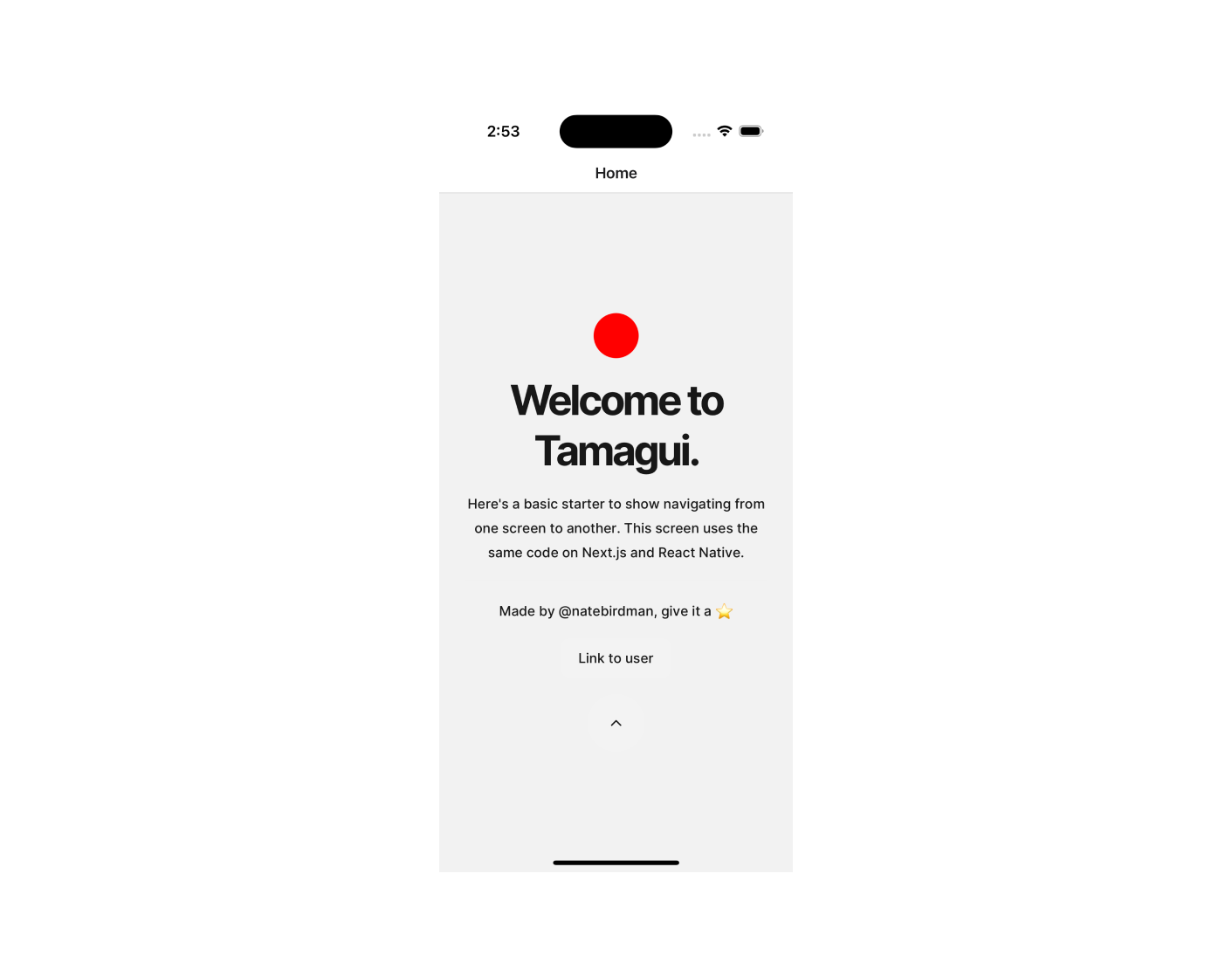
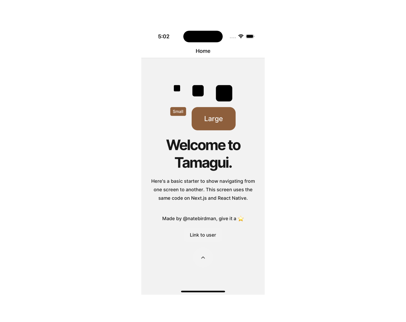
Customising Components with the Styled Library
You can use the styled library to easily customize component styles.
For instance, let's create a Circle component:
Then, add it to the top of your content:
Using Variants for Styling in Tamagui
Variants are custom properties that apply a set of styles at once. Let's define a bordered variant to quickly add a border.
The above code defines a variants object with a custom property called bordered. This boolean variant applies border styles when its value is set to true.
Now, add the following components to our existing XStack:
By using the bordered variant, you can apply a set of styles collectively. Additionally, you can override one of these styles by passing a specific borderColor prop.
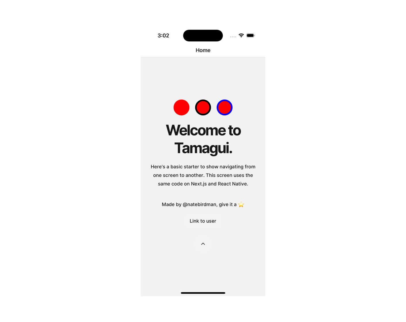
The variant feature offers great flexibility. You can define string variants, number variants, default values, capture "rest" values, and more.
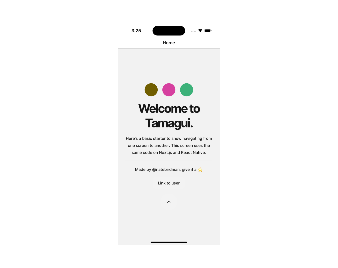
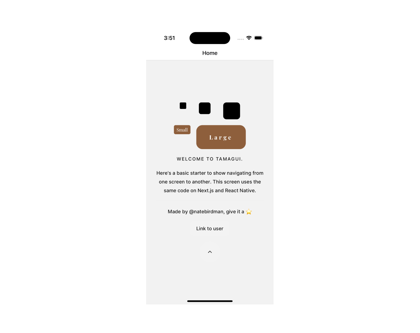
Working with Colour Tokens in Tamagui
Tamagui offers a predefined set of named colours as part of its theme construction capabilities. You can also define your own custom colours.
For a complete list of available colours, refer to tamagui Colour tokens.
To use a colour directly, prepend its name with a $ symbol, as shown below:
If you'd like to define your own colour tokens to match your theme, you can do so by customizing the default Tamagui configuration.
Customising the Tamagui Theme with Custom Colour Tokens
Tamagui's behavior is defined through a configuration object located in packages/ui/src/tamagui.config.ts.
This configuration object sets up the default behaviour for Tamagui and comes with many predefined values. However, you can customize it to suit your needs better.
The tokens object contains a set of predefined tokens, including colour tokens that default to the palette discussed earlier. You can override or add your own colours to this configuration.
In the config object, modify the tokens like so:
Now you can use the new colour token in the same way as the predefined ones:
By customizing the tokens object, you can seamlessly integrate your own colour choices into the Tamagui theme.
Working with Size Tokens
The config.tokens object also defines tokens for sizes, spacing, negative spacing (space(-)), and corner radius. For a comprehensive list, see Tamagui tokens.
Here's an example illustrating how these tokens are defined:
You can apply these tokens directly to the corresponding component properties, as shown below:
Tamagui intelligently maps the right set of tokens based on the property names. For example, width and height properties use tokens from the size set, while borderRadius uses tokens from the radius set.
Some components, like the Button, leverage these tokens to scale various attributes—padding, fontSize, and borderRadius, for example—uniformly.
To define your own size tokens, simply override the config.tokens.size object.
For more information on working with tokens, visit tamagui docs / tokens.
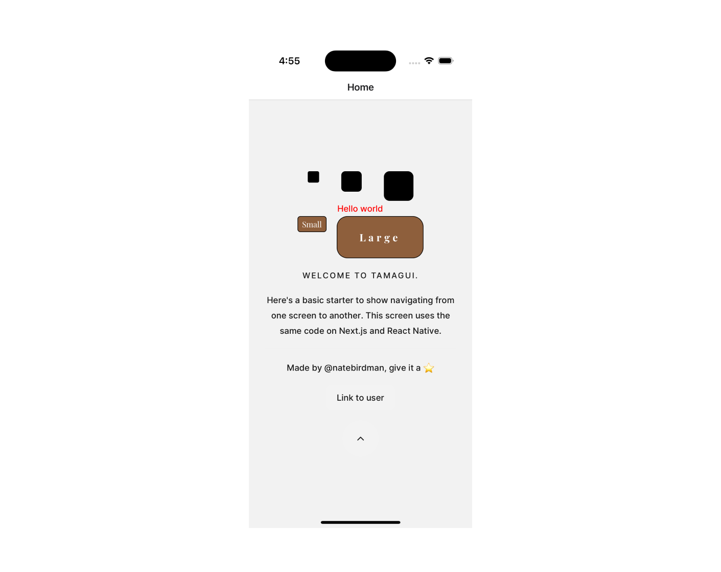
Managing Fonts in Tamagui
Tamagui provides robust features for managing your fonts, including the ability to:
- Control every facet of your fonts, such as weight, spacing, and line height.
- Use different fonts for various languages and switch between them effortlessly.
- Seamlessly switch fonts across different themes and sub-themes.
Tamagui empowers you to achieve fine-grained control over your font settings through these features.
Fonts: Loading Methods
To incorporate fonts into your application, you'll need to load them using platform-specific methods for both web and React Native.
To load fonts on the web, you can use CSS. Create a CSS file named _app.styles.css in the apps/next/pages directory. In this file, import a Google Font (for example, Playfair Display):
Then, import this CSS file into your _app.tsx file located in the same directory:
For Expo, fonts can be loaded using the useFonts hook from the Expo tooling. First, download the font files and place them in the appropriate assets directory. In your _layout.tsx file in the apps/expo/app directory, use the useFonts hook like so:
Fonts: Defining Font Family
Once the fonts are loaded, you can define a font family within your tamagui.config.ts file to specify the styles, sizes, and other parameters for the text in your application.
Here's an example that demonstrates how to set up a custom font family using Tamagui:
In this example, the createFont function is used to configure the Playfair Display font. Various aspects, such as font size, weight, colour, transformation, and letter spacing, are defined for different text sizes (e.g., $6, $7, etc.). The Tamagui library is intelligent enough to fill in any missing values in the ranges you provide.
The face prop defines the fonts to be used in native mode for different fontWeight and fontStyle settings. For example, setting a text component with fontWeight: 600 would automatically use the PlayfairDisplay-SemiBold font in native mode.
Finally, register your custom font as a token in your tamagui.config.ts file. This makes it accessible for use throughout your application.
Fonts: Utilising Custom Fonts
Once your custom font set has been registered in your tamagui configuration, using it throughout your application becomes quite straightforward. Here's how you can set the font family for your components:
In the example above, we've used the $playfair font family for the WookieButton components by setting their fontFamily property to $playfair.
It's worth noting that the tamagui configuration defines two default font tokens: body and heading. These are used as the default fonts for many built-in components. If you decide to change these default tokens to a new font, the change will propagate throughout your application automatically. You will only need to explicitly set the fontFamily for each component if you wish to override the default.
Theming: The Cornerstone of Tamagui
The concept of theming is a vital aspect of Tamagui and offers tremendous flexibility and control. While it's a broad topic that's hard to encapsulate in a single discussion, we'll give you a basic introduction here. For a deeper dive, feel free to consult the Tamagui docs.
At its core, a theme is simply an object that holds preconfigured values which can be used by various components in your application. Here's a very basic example:
You can inject your custom theme into the tamagui configuration by extending the default themes like so:
To employ your custom theme, wrap a component or a group of components in your component tree with the Theme component:
For a more focused approach, you can apply your theme directly to a specific component using the theme prop:
You can also set a theme in a styled component:
One of the truly impressive capabilities of Tamagui is the concept of theme nesting. This allows you to create highly granular themes that can be layered to produce complex visual outcomes. Here's an example:
And then use them in a nested way:
This only scratches the surface of what you can achieve with theming in Tamagui. To explore the full range of possibilities, head over to the tamagui docs.
Conclusion
Tamagui library is a powerful and elegant way to create cross-platform UI components with themes, animations, responsive and pseudo styles, and more. It offers a simple and consistent API for theming your components using CSS variables and theme objects. You can learn more about Tamagui library by visiting its documentation.
Enjoyed this blog? Check out our WatermelonDB tutorial.
Need help with you app? Contact us here.

.jpg)


